
— BY REMON — IN Typography
Master your typography in your designs
In this article, I’ll tell you more about how you can apply your typography skills to your designs.
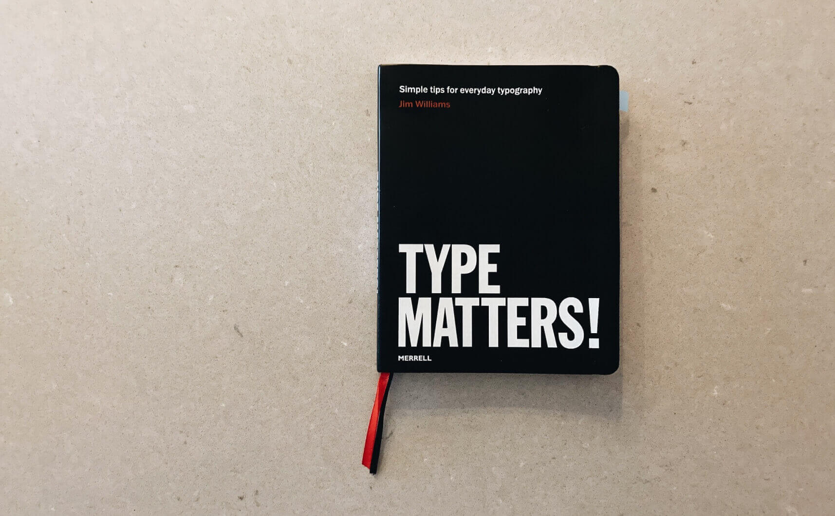
In my early years as a designer, I often struggled with using the right typography in design projects. I mixed different types and font-weights. Furthermore, I did not use a baseline grid or a style guide, let alone researching the right strategy for the client. I often just picked up some fonts that I came across and liked at that time, without any real thought behind it. Over time, I concluded that this method did not benefit my designs. So, I thought to myself how I could get better at typography. To improve my skills, I started delving into the world of typography. For example, I started reading the book Why Type Matters. It describes a practical and useful introduction to typography. I would highly recommend this book to anyone who is not a trained designer but who does do creative work or text editing. I wish I had come across this much sooner! After reading this book, I continued to see if I could draw up guidelines.
By using these guidelines, I was able to give the use of typography in the digital designs a fucking damn boost. This eventually led to much better designs. You can read more about these typography principles below.
Master your basics with these typography principles
First, I drew up nine basic principles with which you can quickly achieve high-quality typography. Another advantage is that this allows you to make choices more decisively. These are the nine principles that I keep in mind when I start a design. Before we dive into the principles in the following important to know. Typography can be divided into the following categories:
Font categories:
- Serif
- Sans Serif
- Display
- Handwriting
- Monospace
Below are the nine guidelines that work very well for me.
- Use not that many fonts
Don’t pair (mix) more than two fonts. When you use more fonts it loses consistency to your design. My preference is to use 1 or a maximum of 2 fonts with multiple weights such as extra when combined. You can skip a weight such as "Regular" and "Extra bold." - Limit Line Length
Try to keep your paragraph length between 40 and 60 characters per line. This means that you will need to adjust your line width for each font size. - Use the right Line-height
Use the right Line-height You can use a golden ratio if you not be comfort how to use line height. I like also to use a line height with a multiple of 1.5 or 1.4. It is also good to use your designer's eye if it doesn't look good, you can always adjust it. - Use a baseline grid
A baseline grid is a series of invisible vertical units that can be used to create consistent vertical spacing with your typography and page elements. It is an invisible way of giving order to disorder. - Letterspacing and caps
It is good to use a different font style like a cap for some titles combine with letter spacing. But you have to keep in mind to do it subtle like the method KISS (Keep it simple, stupid). - Color contrast
You have to match your colors with the right contrast. Make sure the text is readable when you use a background color. - Use right font-size styles
Paragraph text used on the web should be at least 12px. 14-18px is the best choice for me. It’s not too big and it’s comfortable to read. - Use font(s) that are working together
Use fonts that match and complement each other. In this way, you give the user a sense of trust. - Justify left and the Gap
Do not use a large amount of centered text, it is not a natural way of reading. (left align text center align+ right Align + justified align)
You could make a complete design with just 1 type if you know what you’re doing.
Find the right strategic questions to ask.
Now that we know this, we can start thinking about the right strategy for using typography. Typography can make or break a product. So, it’s important that typography is applied correctly, within the strategy you’ve developed in advance for the project. That is why it’s important to ask yourself the right questions before choosing the typography. By asking the strategic questions below, you can better determine the search direction. This makes it easier to substantiate the choices to the customer in the future.
The following can be asked to start defining the strategy
- Who is your target group?
- In what industry is the client located?
- What is the look and feel of the branding of the client?
Below is an example after answering the questions:
- Target group → People between 20 – 40 years old
- Industry → Furniture, e-commerce
- Look and feel → Calm & minimal vibes
Discover and collect ideas
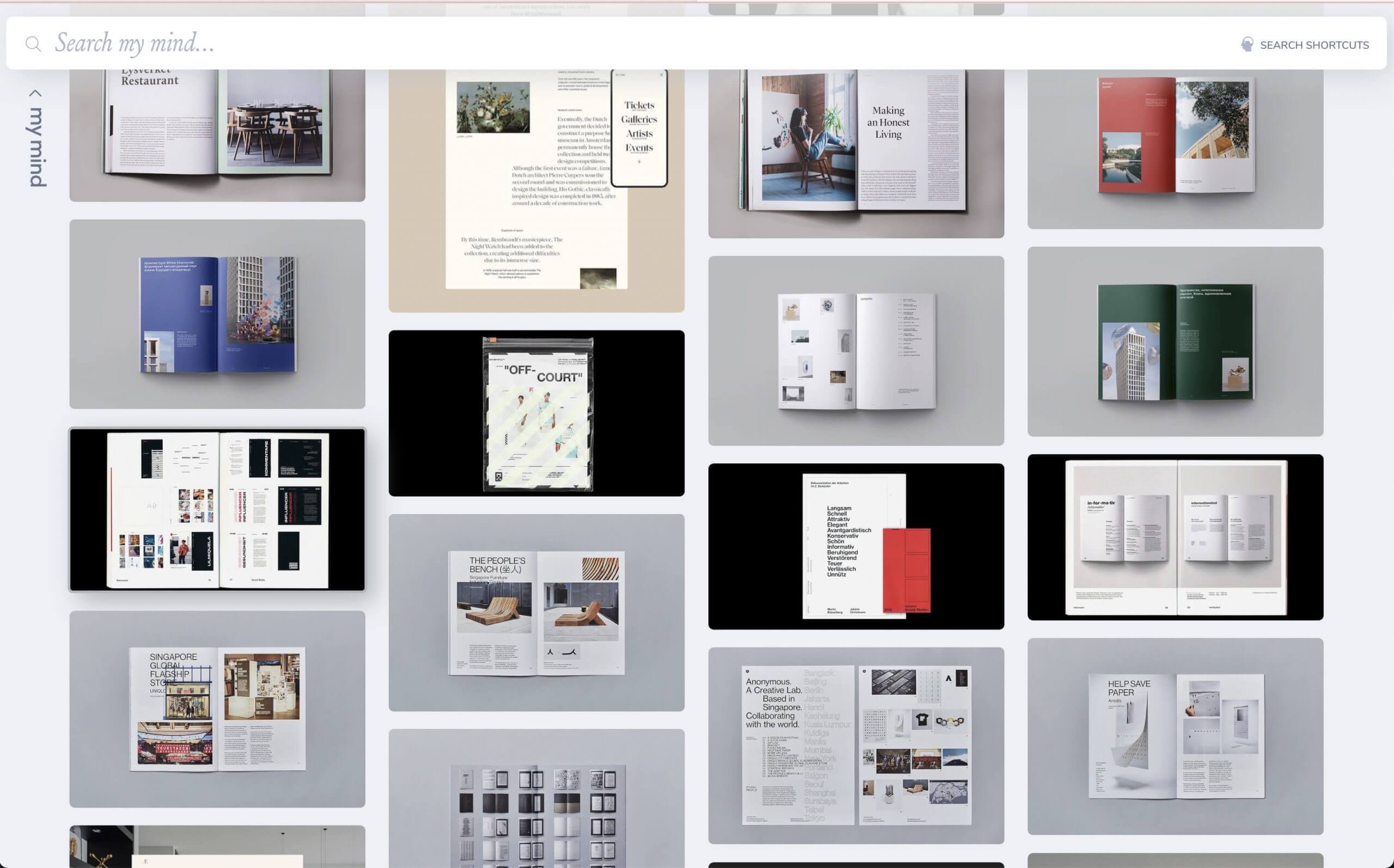
After answering the questions above, you can start looking for inspiration. I use Pinterest for inspiration. In addition, I find inspiration for typography from offline media, such as magazines.
For example, I read the National Geographic magazine while on the plane on my way to Bilbao (Spain). In it, I came across a stunning sans serif type, which really appealed to me. I took a picture of it, then I went looking for the font on what the font. From there, I keep in mind what matches with the chosen branding.
Collect ideas
To determine the right look and feel for the typography, I put together a mood board. This is a collection of typography most appealing to me for design later. You could discuss this mood board with the customer, because it’s important to involve your customer in your design choices, this way the customer knows what you’ve based certain choices on. In the example below you see a mood board with the typography that inspires me.
There is no right secret or magic recipe to find the right font, it is all about feeling.
Real example
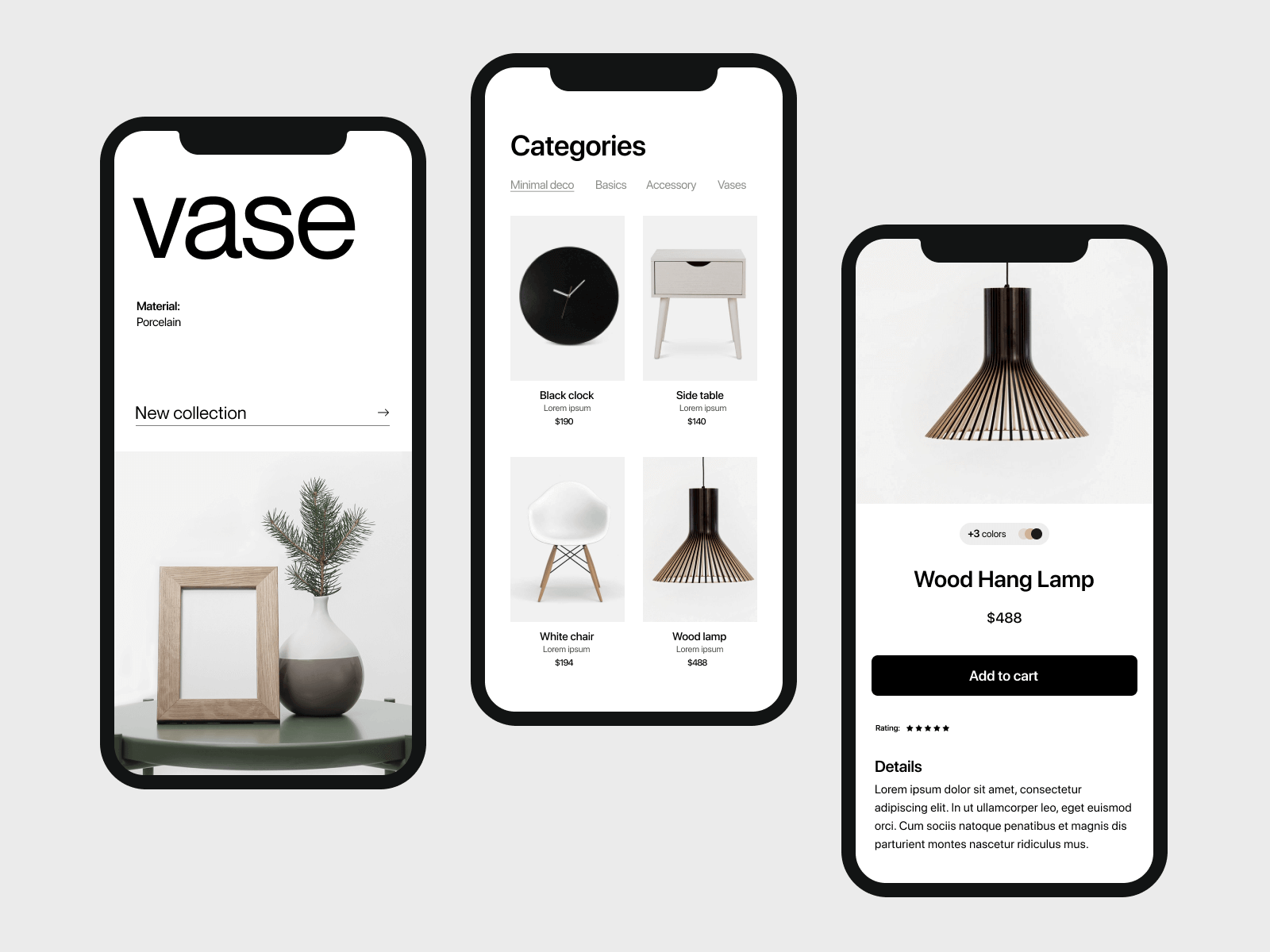
Now we get to the juicy part of the work. Here we bring together everything we outlined above. To put it into action I made a minimalistic design for the furniture branch. Below is the mobile design implementation based on the typography “Neue Montreal”.
Key take-aways
Picking the right font is all about:
- Make or break step in your design
- It’s an emotional thing
- Is all about the right feeling
- There is no magic recipe to find the right font
Comments