
— BY REMON — IN Typography
Typographic love: 5 of my favourite fonts
Typography is one of my favorite things about design. I enjoy the way that a simple font can change the whole look and feel of something, like how Helvetica gives you a different feeling than Didot does.
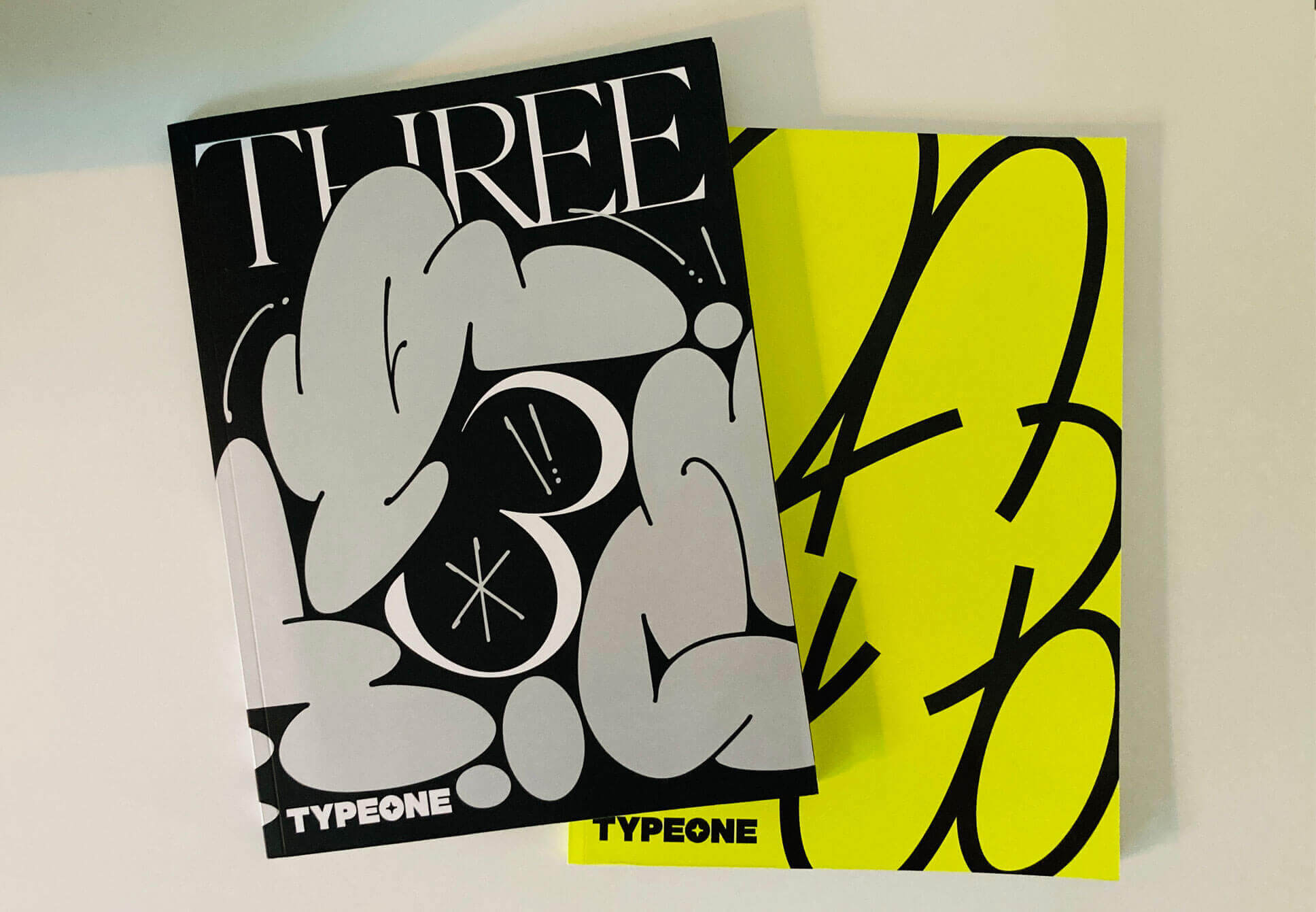
As a designer, I’m always looking for inspiration. That’s why I love print magazines so much, they’re full of inspiration and good design. But what really excites me is when I find an offline source that inspires my online work. In this day and age when everything is digital and online, it’s nice to have something to hold in your hands that doesn’t require an internet connection or battery power. This is especially true for magazines because you can actually enjoy them without any distractions from social media or advertisements popping up on your screen as soon as you open them up (which really ruins a magazine experience).
I love print. I love the physicality of print, the smell of it and the feel of it.
5 Of My Favorite Fonts
One of the most important aspects of any type of design is choosing a font. Fonts are so crucial to design because they have a huge effect on how people receive your message. So here are my favorite fonts from around the internet! They are not in any particular order, because they are all amazing in their own special way.
Neue Montreal
This font is one of my favorites because it’s friendly and easy to read. The letters are slightly spaced apart, which gives it a unique look and feel. It’s also fun to play around with the different styles. It’s so clean, and it has so many weights and styles to choose from. It’s great for typography, especially when you’re looking for something that will look good across multiple devices. It’s simple because it’s a versatile Grotesque font, but has some interesting quirks that can help you convey your message in a unique way. It’s great for both text and display, and it works well on websites and in print.
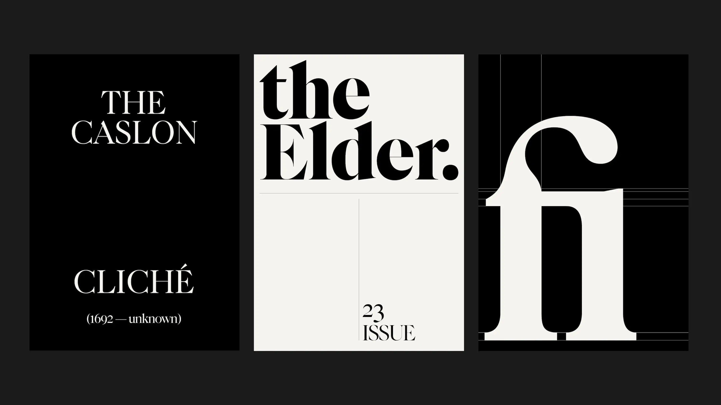
Caslon
Caslon is a typeface designed by William Caslon. It was the first typeface to be printed on a printing press, and it’s still considered one of the best classic fonts ever created. It was designed to be used for body text, which is why it’s so readable. But what makes it so special? Well, there aren’t many other things like it out there. Most fonts are modeled after other fonts—they’re derivative works that have been inspired by past work or previous designs. But Caslon wasn’t based on any existing typefaces; instead, William Caslon used his own creative vision to create something completely original and unique in its own right!
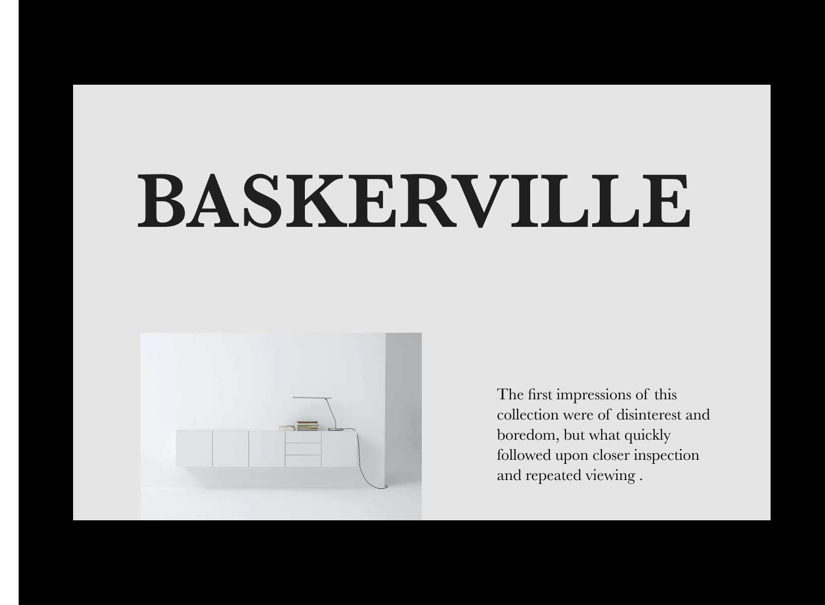
Baskerville
Baskerville is a serif typeface designed by John Baskerville. It is considered one of the first transitional typefaces, a period style between old style and modern type. The font was created for printing, but it also has characteristics of calligraphy which makes it legible at small sizes.
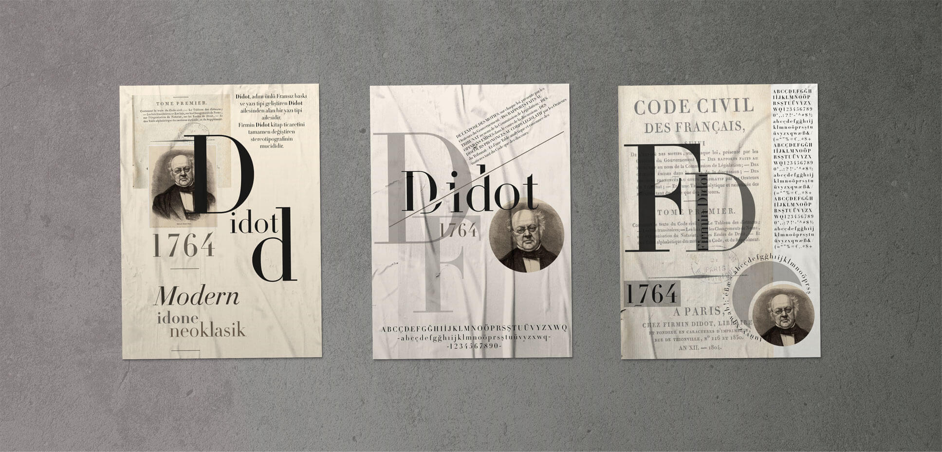
Didot
The font Didot is a great choice for design because it has a very classic look and feel, which can be very useful for designs that need to convey a sense of tradition or history. I think it’s perfect for headers and sub-headers, but it can also be used for paragraph text. The way the letters are designed makes it easy to read, and it’s got a very elegant feel to it. The font also has a distinct style and personality, which makes it ideal for use in designs that need to project an image of elegance or sophistication.
GT America
Designers love typefaces. It’s that simple. And I love GT America. It was designed to be used in text and display settings, so it works great in websites, apps or any other design project where you need a font that looks good on the screen or printed out in black and white. It’s a great modern font that can be used for both design and branding. The font is clean and easy to read, but still has a lot of character and personality. It was designed by Noël Leu with additional work by Seb McLauchlan from the Grilli type studio.
What fonts do you like?
Do you have a font that always makes you smile?, and why? What’s your go-to font when you want something to look professional? Leave them in the comments below. Your responses will help future readers discover new fonts that they may love as much as we do! As always, leave your answers in the comments below!
Comments